
Poster designers helped put Orlando indie music scene on the map
By Rick Kilby, from the Fall 2022 edition of Reflections Magazine
When I moved to Orlando in the late 1980s, the city was in the midst of a boom that had started with Disney World opening in 1971 and was accelerating toward the long-awaited debut of Universal Studios in 1990. I arrived after the demise of Orange County’s citrus era, when the region morphed into a tourism behemoth that attracted talented and hopeful workers from all over the globe. By the early ’90s, these new residents were creating a major impact on the region, and you could feel a palpable energy of raw potential pulsing through the community. Creativity of all kinds was bursting at the seams.
A downtown in atrophy, with little life outside of Church Street Station, was about to be reborn as a destination for cutting-edge live music. The musical scene that emerged as a result of this metamorphosis caused ripples that still resonate throughout the region today.
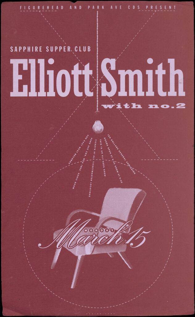
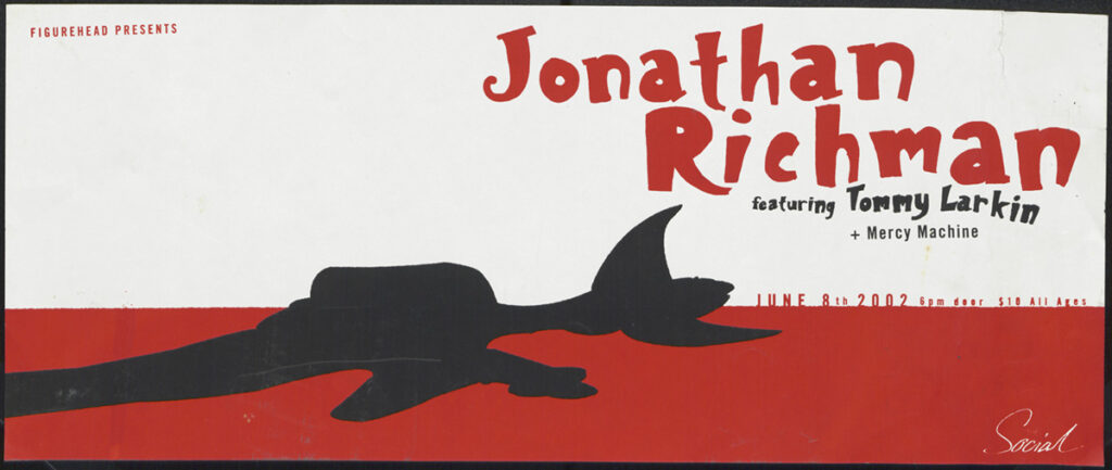
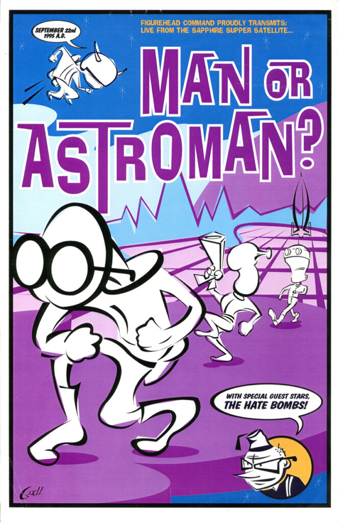
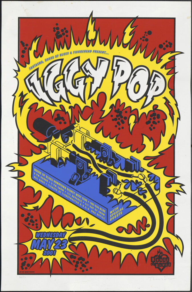
The distinctive look of this period was established by rock posters that helped put the Orlando scene on the map. Jim Faherty, founder of Orlando-based Figurehead Records, maintains that five local graphic designers and illustrators were largely responsible for that unmistakable visual identity. In many ways the look they shaped was the antithesis of the squeaky-clean, family-friendly Disney image. The posters they created had roots in punk rock but ultimately evolved into something much more sophisticated.
As a graphic designer and fan of indie music myself, and also a contemporary of the “Figurehead Five,” I had a front-row seat to this burst of inspiration on paper. I must confess admiration (and perhaps a bit of envy) for the five – as designers and musicians. In addition to being successful graphic designers and illustrators, all of them – Thomas Scott, Jeff Matz, Scott Sugiuchi, Greg Reinel, and Klaus Heesch – were in rock bands, at least briefly.
From Nicoteens to Giant Men
The Figurehead Five cut their teeth in an era of FM radio, legendary independent record stores, and earth-shaking concerts. Thomas Scott grew up in western Pennsylvania, had a voracious appetite for live punk music, and worked in record stores before coming to Central Florida, where he reunited with his buddy from up north, Jim Faherty. Scott Sugiuchi grew up in Orlando on a diet of classic rock and joined his first band as the bass player while he was a student at the University of Central Florida (UCF). Klaus Heesch, on the other hand, remembers immersing himself in country music before discovering new wave while in high school. Jeff Matz had guitar lessons in high school but did not play in his first band until his college days at the Ringling College of Art and Design in Sarasota. Greg Reinel didn’t arrive in Central Florida until he was a senior in high school, but he soon found himself in a band. Often the five designed flyers for their own bands.
Several of the designers would play together; Sugiuchi and Heesch were both members of Giant Man, and Heesch and Matz were in Killing Everything. Thomas Scott was only briefly a member of a band called Sleeping Arrangements that may best be remembered for performing at Figurehead Records’ first show.
Sugiuchi and Reinel’s bands both had a degree of musical success beyond Orlando. The Hate Bombs, Sugiuchi’s band, released records that gained attention in the garage-band music scene, enabling them to tour extensively. Reinel fronted a number of bands, including the Nicoteens, but his most successful band, Nutrajet, was signed by a British label and toured overseas. In the ’90s the Hate Bombs and Nutrajet would perform together around town. Nutrajet earned a reputation for being extremely loud, to which Reinel would snarl, “If you’re gonna be a rock ’n’ roll band, then be one.”
Artistic Tendencies
All five designers agree that their love of music informed their design work for Figurehead. While working on show posters, they were aware of one another’s work, but each of the five had different paths to becoming visual artists. Reinel, perhaps the best pure draftsman of the group, remembers taking up drawing at the age of 4. Thomas Scott grew up wanting to be a comic-book artist but turned to graphic design after concluding that “he couldn’t draw well enough.”
By college, however, they were all accomplished enough to have opportunities to go to art school. Scott attended the Pittsburgh Art Institute; Reinel was offered (and turned down) a Pell grant to attend the prestigious Art Institute of Chicago; Sugiuchi studied graphic design at UCF; Matz graduated from the Ringling College of Art and Design; and Heesch was offered a scholarship to the Savannah College of Art and Design but instead went to UCF because it offered computer-based design classes.
Their design careers all started modestly. This was the period just before computer-based desktop publishing became the industry standard, and several of the five started out doing paste-up, which is preparing mechanical artwork by hand for offset printing. Eventually Jeff Matz found his way to work in advertising agencies, which led to the creation of McQuien Matz, a two-man agency he started with copywriter Ron McQuien. When they became successful, mostly on the strength of work for Disney Resorts, the small agency hired Thomas Scott. After hours, Scott would work on band posters for Figurehead, which is how Matz got connected to Faherty. When Scott left to start his own design business, Eye Noise, he was replaced at McQuien Matz by Klaus Heesch.
“Retina-Searing Eye Candy”
Matz has described his process for designing show posters as a creative exercise to be solved quickly, after hours, often using “found art.” Pop culture heavily influenced the visual language of all the designers, from Hanna-Barbera cartoons and spaghetti western movies to mid-century kitsch and vintage science fiction.
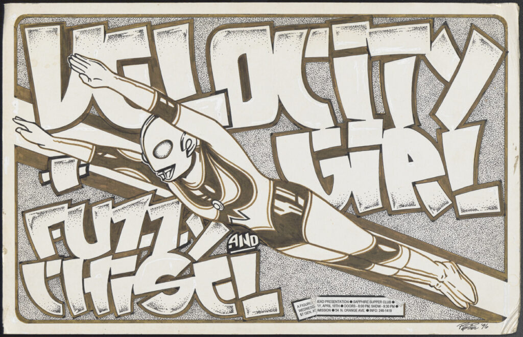
Despite advances in computer graphics, the Figurehead Five embraced a low-tech approach to design, to maintain what Sugiuchi called a “punk rock aesthetic.” Heesch remembers striving for a “cut-and-paste” look by “hand-doing stuff and photo-copying.” Eye-catching imagery was the key to creating an effective poster, and the designers used black-and-white engravings from clip-art books, elements from old ads with oversized halftone dots, and original drawings to illustrate a song or something related to the band.
Often images were combined to create sophisticated visual puns. The goal, according to Reinel, was to get “asses through the doors” with a concept that was appropriate for the band and not just a product of the “artistic ego” of the designer who created it. In a 2018 social media post promoting an exhibit of what he called his “retina-searing eye candy,” Reinel reminisced about prowling the streets in his poster art persona, “Stainboy,” and “painting the city with dangerous rock poster Day-Glo.”
One method of reproduction that would ultimately make their posters more collectible was screen printing, a technique used mostly for T-shirts in which ink is forced through a porous screen onto the printing surface. Initially a third-party vendor had to do the printing, but when Heesch bought his own screen-printing equipment, Matz and Scott started “pulling prints” at Heesch’s studio. Screen printing allows for opaque, vivid ink colors that can be printed on a wide variety of paper stocks, and each print of an edition is a unique work of art due to the handmade nature of the process. “That’s when poster making got really fun,” Heesch recalls.
A Continuum of Creativity
Before Figurehead Records and the indie rock music scene evolved in Orlando, no one gave the city’s musical climate any credit, according to Sugiuchi. At the time Athens, Seattle, and Austin were known as hotbeds of indie music, but to Sugiuchi, the Orlando scene was equivalent. Matz agrees that Figurehead put Orlando on the map for touring indie bands. The work of the five designers helped establish the Orlando scene’s visual identity, and their work earned national recognition.
The popularity of the show posters extended well beyond the concerts they were intended to promote. The Figurehead Five earned accolades for their work in professional publications, at award shows, and as part of a growing show-poster culture epitomized by the Flatstock exhibition held annually at the South by Southwest (SXSW) festival in Austin. There, fans can view show-poster displays and meet the artists who created them.
I vividly remember my favorite posters created by the Figurehead Five. I have Thomas Scott’s Iron and Wine poster on my office wall. Jeff Matz’s Anti-Pop Music Festival poster based on a Russian prison tattoo earned recognition in Communication Arts magazine. Greg Reinel’s epic black-and-white poster for guitar legend Dick Dale portrayed a scantily clad woman surfer on waves of human skulls, rich in his trademark idiosyncratic detail.
When I arrived in Orlando, it felt like it was a place struggling for an identity. Today I’ve witnessed it evolve into a dynamic city that celebrates creativity and diversity. “We’re all part of a continuum,” Reinel professes, noting that the vibrant music scene in Orlando had “real positive energy” and a distinct “sense of possibility.”
Heesch expresses a similar sentiment, noting that Orlando matured into a community with a forward-thinking “collaborative spirit.” Having observed Orlando’s evolution from a similar perspective, I admit to a sense of nostalgia for those days when the town seemed to buzz with a fresh energy. But I can also connect the dots to who we are today from that brief period when eye-catching, innovative artwork plastered downtown windows.